Marie
What Pantone's Choice of White Tells Us About Color (And Maybe About Us)
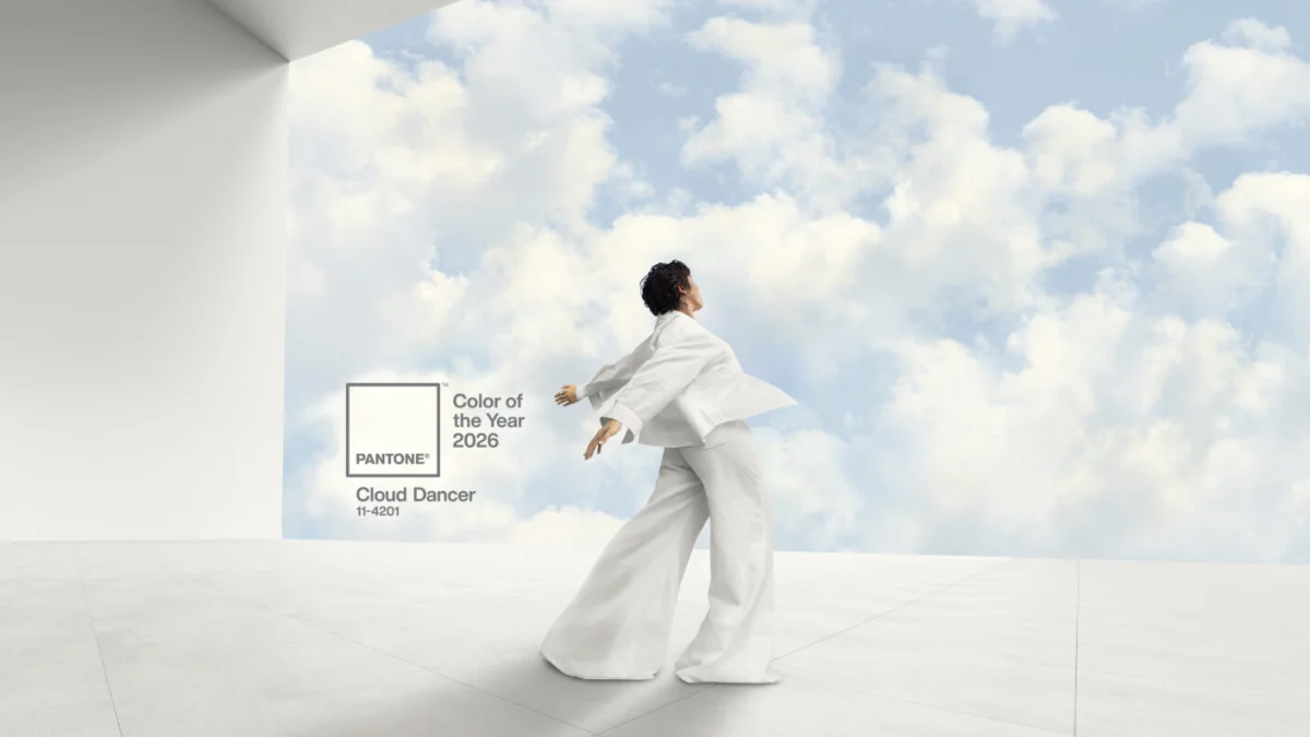
For the first time in 25 years, Pantone chose white as their Color of the Year. Cloud Dancer, they're calling it—"a billowy, balanced white imbued with serenity."
The internet lost its mind. Some people called it "as inspired as mayonnaise." Others called it tone-deaf. A few called it a political statement.
But before we get into what they might be saying with this choice, let's talk about who Pantone actually is—and why their opinion on color matters at all.
The Pantone System
In 1962, Lawrence Herbert had a problem. He was working at a commercial printing company that made color charts for cosmetics and fashion companies, and he noticed something frustrating: there was no standard language for color. When a designer asked for "beige," every ink manufacturer mixed something different. "Cream" in New York was not the same as "cream" in Tokyo.
Herbert, who had a chemistry background, started hand-mixing his own combinations and assigning each one a unique number. He bought the company and renamed it Pantone, and in 1963 he introduced the Pantone Matching System.
The idea was simple but revolutionary: if you wanted Pantone 186 C, you got Pantone 186 C—whether you were printing in New Jersey or Japan. It's a recipe book for color. Every shade has an exact ink formula, so manufacturers anywhere in the world can reproduce it without ever seeing a physical sample.
Here's my favorite example of why this matters: Kodak used to have their film boxes printed by several different companies. The problem? Each printer produced a slightly different shade of yellow. Customers started believing that the boxes with the clearest, brightest yellow contained the "freshest" film. Once Kodak standardized on a Pantone yellow, every box looked identical—no matter where it was printed.
Today, Pantone codes are everywhere. Coca-Cola Red is Pantone 186 C. Facebook Blue is Pantone 286 C. Tiffany has trademarked their signature blue-green. Even governments use Pantone to specify the exact colors of their flags—Texas, Canada, and South Korea have all legislated specific PMS colors.
The Color of the Year Program
Since 1999, Pantone has announced a "Color of the Year" every December. A team of what they call "color anthropologists" meets twice a year in secret, in European capitals, to debate and analyze everything from fashion shows to social movements to technology trends. After two days of presentations, they crown a color that supposedly captures the global mood.
But here's what I've noticed: the Color of the Year isn't about what's popular. It's about what Pantone thinks we need.
And there's a pattern.
Every time there's been a major world crisis, Pantone has responded with a deep, reassuring blue—followed the next year by a bright, hopeful yellow.
2008 Financial Crisis: - 2008: Blue Iris—a calming blue-purple meant to "satisfy the need for reassurance in a complex world" - 2009: Mimosa—a cheerful yellow because "the economic climate" called for "a dose of happy optimism"
2020 COVID Pandemic: - 2020: Classic Blue—"tranquil, dependable," giving us "a familiar starting point from which we can center our thoughts" - 2021: Illuminating + Ultimate Gray—that yellow again, described as "sparkling with vivacity, imbued with solar power"
Blue to calm us down. Yellow to lift us back up.

So what does it mean when they choose white?
The Controversy
Cloud Dancer is the first white Pantone has ever chosen. And the reaction was immediate.
Some designers called it boring. Others called it a recession indicator. One Instagram user said it "feels like a microaggression." A Vanity Fair correspondent wrote that after a year of debates about diversity initiatives, "it feels bold, and dare I say out of touch, to utter the words 'white is the color of 2026.'"
Pantone pushed back. Their executive director released a statement saying the choice was about "emotional and creative resonance, not a statement on politics, ideology, or race." They emphasized that this particular white has "equal balance of cool and warm undertones"—not stark or sterile, but natural and honest.
The designer community is split. Some see it as a retreat—white "does not disturb, does not rock the boat." Others see it as permission to breathe, a blank canvas after years of pandemic uncertainty and political chaos.
One thing is clear: Pantone knew this would start a conversation.
What I Think
We'll probably never know exactly why they chose white. Pantone's selection process is deliberately mysterious, and they're clearly not going to admit to any political intent.
But I think that's the point.
Pantone isn't just selling a color. They're selling a conversation about color. About what shades mean, what feelings they evoke, what messages they send.
White can be a wedding dress or a surrender flag. It can be a fresh start or an erasure. It can be sterile and cold or soft and peaceful. It's the presence of all colors or the absence of any. It depends entirely on context—and on who's looking.
And maybe that's exactly what Pantone wanted us to think about.
As a photographer, here's what I know: I need white in the highlights and black in the shadows. I need both. Without white, there's no dimension. Without black, there's no depth. They're not opposites fighting each other—they're partners creating the full picture.
Maybe that's the real message. Not that white is better or worse than any other color. We just have to balance it.
So whether you love Cloud Dancer or hate it, Pantone got what they wanted. We're all talking about color. We're all asking what it means.
And I'm all for that.
You May Also Like
Studio Life
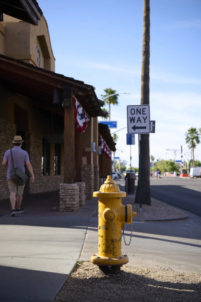
The Color Challenge: 90 Minutes Photographing Downtown Scottsdale
A morning in downtown Scottsdale with two photographers, three colors, and one very determined Canon on her knees.
News
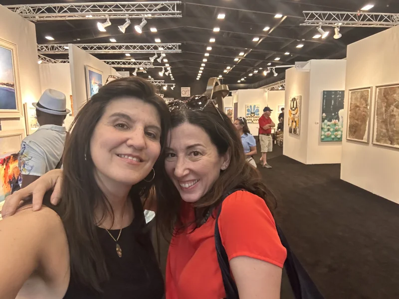
Admiring vs. Feeling: Reflections on Scottsdale Art Week Photography
Standing before original photographs at Scottsdale Art Week, I was reminded of something we forget in our filtered, curated visual world: there is a profound difference between admiring something and feeling something.

Tips & Guides
What Kind of Photos Do You Actually Need for a Personal Brand Shoot?
More than a headshot, less than a stock library. Here is the real mix of images a personal brand shoot should give you: working shots, different looks, props, and a signature color that ties the whole set together.