Marie

What Colors Should You Wear for Your Headshot?
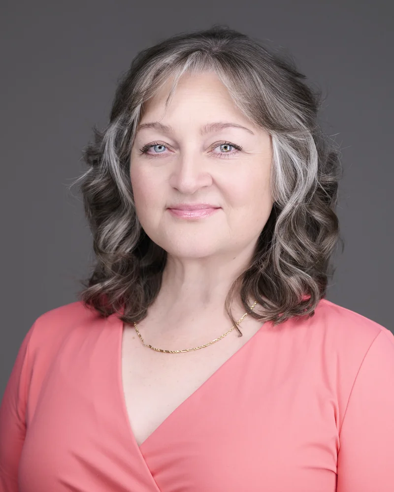
I own a black silk button-down. Every single time I wear it, someone asks if I'm feeling OK. Not once. Every time.
For a long time I blamed my dark hair. I figured black near my face plus dark hair just washed me out, and that was that. But then I noticed something. When I wore other black clothing, I didn't look nearly as tired. Same color, same hair, completely different effect. Something else was going on.
So I did a color analysis. It turns out I'm a soft autumn, which means I need warm undertones to look my best. That black silk shirt has a cool, flat quality against my skin that drains the warmth right out of my face. Other black pieces with slightly different undertones and textures do not do that. The mystery was solved, and I have not looked back since.
I bring this up because color comes up in almost every conversation I have with clients before a session. And what I learned from that shirt changed the advice I give.
Why Color Matters So Much More in a Headshot
In everyday life, the wrong color is a minor thing. You look a little tired in one shirt, fine in another, and nobody thinks about it for more than a second.
In a headshot, it is not minor at all.
A headshot is tightly cropped. The color you wear sits directly next to your face, filling most of the frame. There is nowhere for it to hide. If the undertone fights your complexion, it does not just look slightly off. It can make you look tired, washed out, or unwell in the one photo you are going to use everywhere: LinkedIn, your website, your email signature, conference programs, press features.
That is a lot of pressure to put on a single wardrobe choice. And most people choose their headshot outfit based on what they like or what is clean and ironed, not on whether the color actually flatters them. It is completely understandable. But it is also the easiest thing in the world to get right once you know how.
What I Used to Say vs. What I Say Now
For years, my wardrobe advice was the standard photographer answer. Bring neutrals, blues, or burgundies. Safe colors that work on most people.
And that advice is not wrong. Those colors do work reasonably well for a lot of people. But "reasonably well for a lot of people" is not the same as "genuinely flattering for you." After my own experience with color analysis, I realized I could give people something much better than a safe default.
So now I say something different. Before your session, do a color season test.
What a Color Season Test Actually Is
Personal color analysis is a styling framework that sorts people into seasonal palettes, such as soft autumn, cool winter, warm spring, and so on, based on your skin's undertone and how much contrast suits you. The idea is that certain colors make you look vibrant and healthy, while others drain you, and your best colors tend to cluster together in a recognizable family.
It is a styling tool, not an exact science, and results can vary a little between quick online quizzes and a trained analyst. But as a practical guide for what to wear, it is genuinely useful. It certainly was for me.
If you search something like "what is my season color palette," you will find free tools that walk you through it. It takes a few minutes, and for a lot of people, it is a small revelation.
The Client Who Proved the Point
I had a client bring a beautiful pink top to her session. She loved it. The problem was that the pink was very saturated, very bright, and it completely overwhelmed her. It pulled attention away from her face and fought with her complexion.
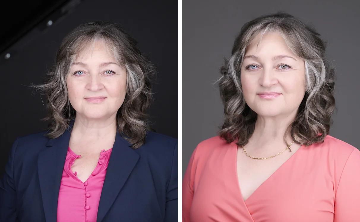
We tried a softer, more muted color instead. The difference was immediate and obvious. In the softer shade, her skin looked healthy, her eyes stood out, and the focus landed exactly where it should: on her. Same person, same lighting, same everything. Just a color that worked with her instead of against her.
That is the whole point. It is not that bright colors are bad or that some colors are universally better. It is that the right color for you lets your face be the subject of the photo, which is exactly what a headshot is supposed to do.
A Brilliant Trick From Another Client
One of my clients did something so clever I have been recommending it ever since.
After she found her color season, she bought a small keychain on Etsy with beads in each of her palette's colors. She keeps it with her when she shops. When she is looking at a piece of clothing, she holds it up against the beads. If the color matches one of the beads, it is in her palette and she considers it. If it does not, she puts it back.
The bonus is that because everything she buys comes from the same palette, her whole wardrobe now works together. She can mix and match almost anything, because it all belongs to the same color family. One small tool, and her closet became a coordinated system.
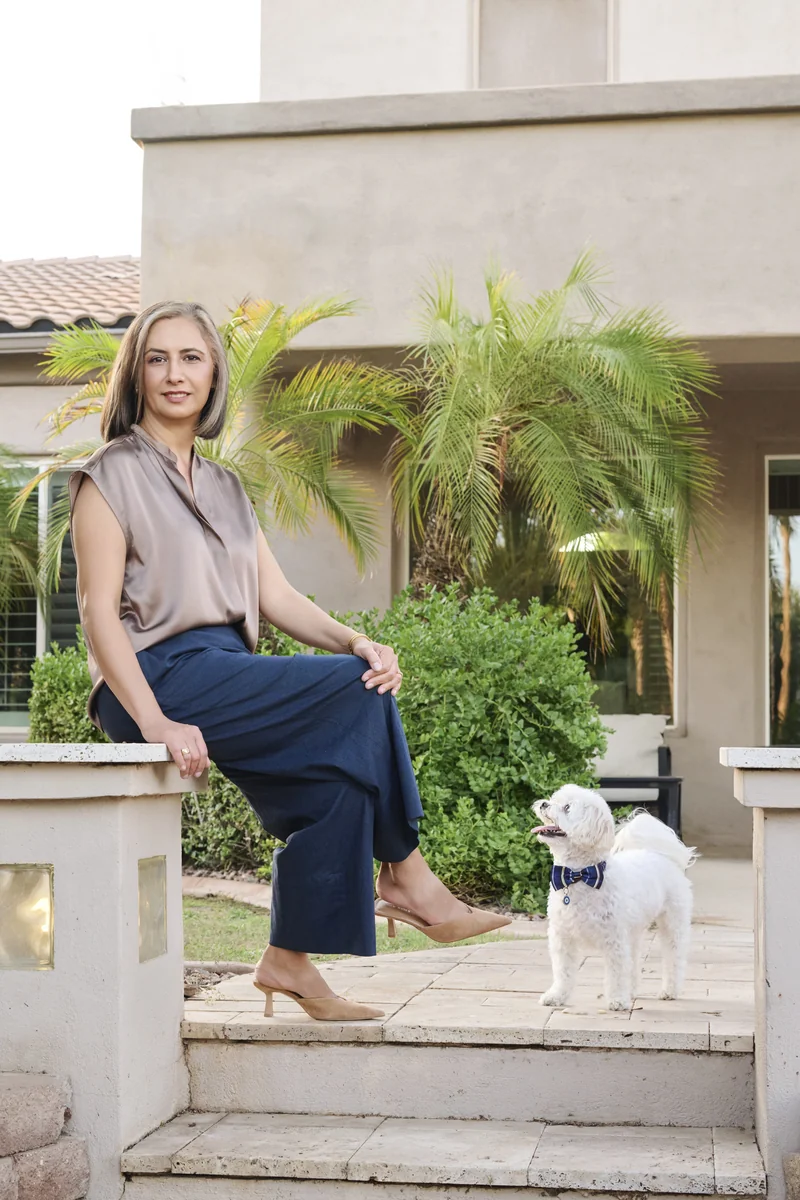
I thought it was genius.
The Unexpected Bonus: You Save So Much Time
Here is the part I did not expect. Since I started sticking to my soft autumn palette, shopping has become dramatically faster.
I simply do not look at clothes that are not in my color season. A whole rack of options gets filtered out in seconds because I know it is not for me. I am no longer tempted by things that will end up making me look tired, like that black silk shirt. I spend less, I return less, and everything I own actually works together.
What started as a fix for a headshot problem turned into a genuinely useful life tool.
What to Do Before Your Headshot Session in PHX
If you are booking a headshot and wondering what to wear, here is my honest advice now. Before you shop or pull something from your closet, spend a few minutes finding your color season. Then choose something from your palette that you feel great in.
You will look healthier, more like yourself, and more present in the final image. And the color will do its quiet job of keeping all the attention where it belongs: on your face.
Color is one piece of the outfit. For blazers, necklines, and fit, read what to wear for your headshot.
If you want help thinking it through before your session, just ask. It is one of my favorite conversations to have.
You May Also Like
What to Wear for Your Headshot: A Guide for Women
Wear what you would wear to an important business meeting. A Phoenix photographer's guide to blazers, color, necklines, fit, and the one exception.
Best Makeup for Professional Headshots — A Photographer's Honest Guide
You probably don't need a makeup artist for your headshot. A Phoenix photographer's honest guide to DIY makeup for a polished, natural, camera-ready look.

What to Wear for a Professional Headshot (Men's Guide)
Suits, blazers, or something else entirely? The right outfit depends on your industry, not a dress code. A Phoenix photographer's guide to colors, grooming, and common mistakes.
